Helping new doctors choose their medical residency path with a mentor
Our Customers
In Brazil, while nearly 25 thousand doctors are trained each year and more than 38 thousand places are available for graduation, only 17 thousand places are available for medical residency.
Constraints
I had one week to present an MVP that would ensure the resolution of these primary issues.
Their Problems
Medical students who have recently graduated generally struggle to choose a specialization course. They suffer from a lack of resources to make their decision more accessible, as well as a lack of time to understand their options better.
My Role
As a designer I was responsible for researcher, and UX/ UI designer.
Timeline
1 week in 2021
Client
Sanar
Understanding the User
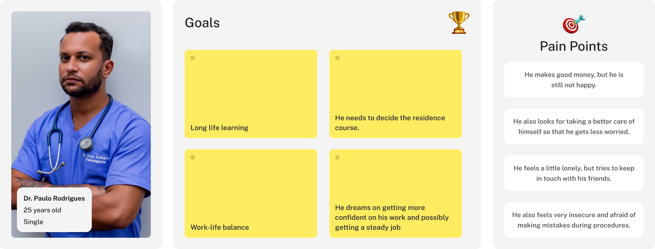
"I don't have time to figure out my future."
Interview
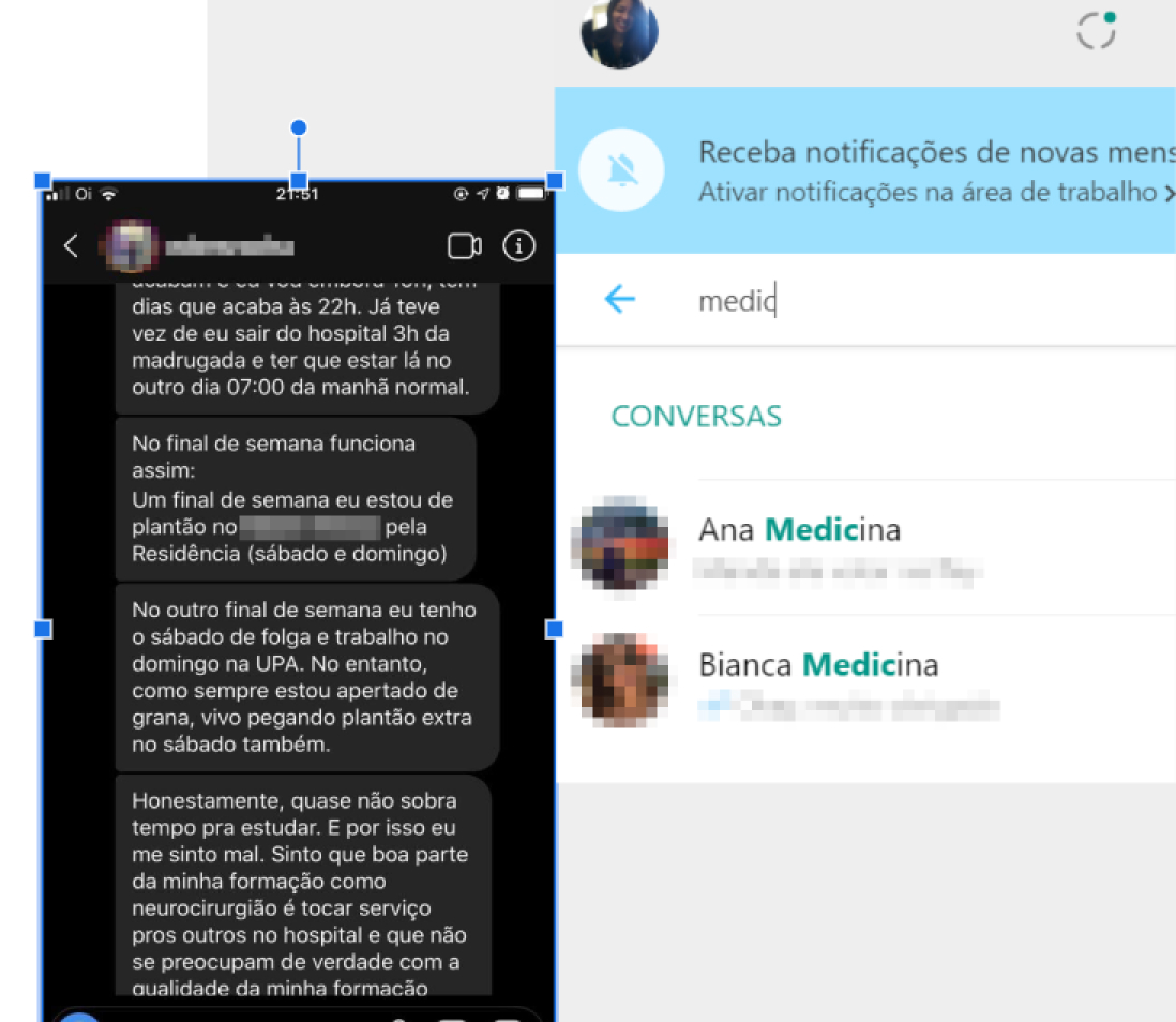
I interviewed five participants: two recent graduates and three students currently enrolled in a medical residency program.
I conducted semi-structured interviews because the conversations took place over WhatsApp and Instagram, which allowed flexibility to explore additional topics as they naturally emerged.
To guide the interviews and ensure consistency across conversations, I focused on the following key points:
Tell me a little about yourself, where do you live, your age, what do you do?
How do you organize your study routine?
What difficulties do you have or had to prepare for the residency?
Value Proposition Canvas
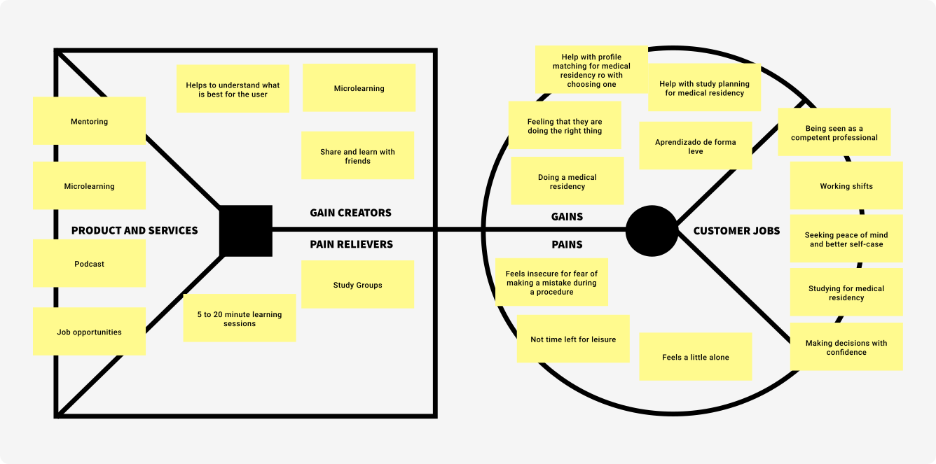
I used the tool Value Proposition Canvas because it gave me a holistic view of the Sanars' services witch are already offered and can be offered to solve Dr. Bruno Rodrigues' problem.
Competitive analysis
I looked into Sanar's positioning in the market, the level of competitors then and the advantages of putting such a feature that I was proposing.
Why I chose to prioritize Mentorship
The initial approach aimed to comprehend the challenges faced by both internal users and external customers, as well as their perceptions of the legacy system.
The decision to use the CSD matrix stemmed from the lack of well-defined information and numerous uncertainties surrounding the perceptions of internal users and external customers regarding the current solution. This approach also facilitates aligning everyone's understanding of the problem and provides a concise overview of the unstructured information, which can subsequently be validated through other research methods.
Tamires Lelis
Product Designer
Sketching ideas
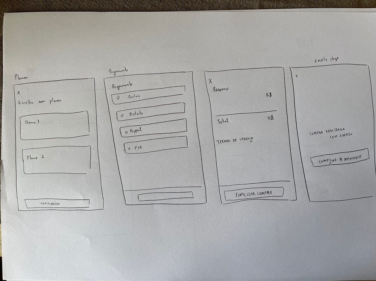
After working through a few initial sketches, I understood that some of the concepts I had in mind wouldn't work. Not only I was able to visualize quickly, but I quickly filtered the good and bad ideas out.
Wireframes
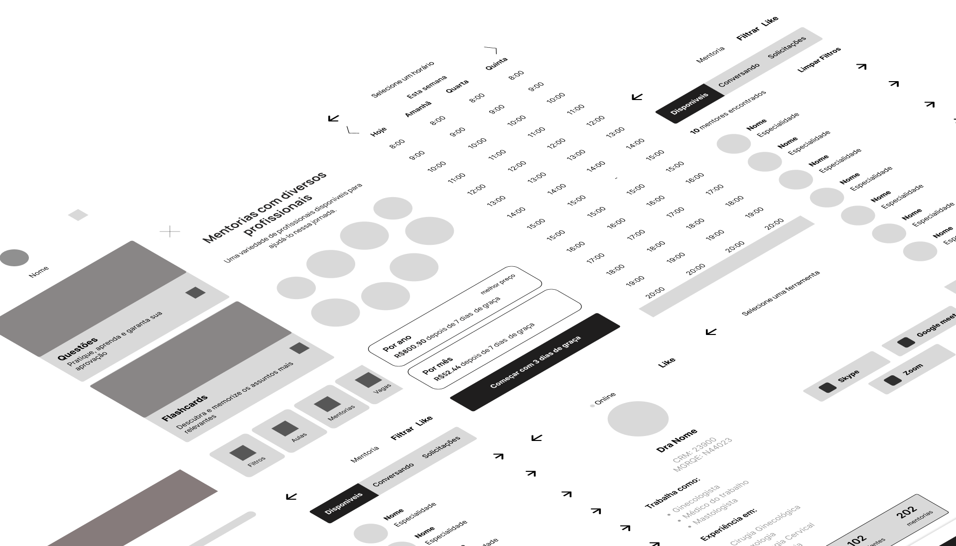
After sketching a lot of ideas. I started to work on the skeleton of the solution, I care if all the information is really in there, and how it is organized from screen to screen. At that moment I'm dealing with issues of form, arrangement, and information volume.
User Interface
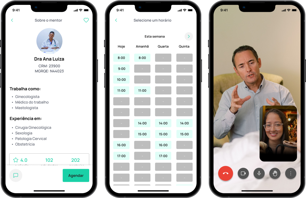
Users can book a mentoring session, filter the mentor based on specialization, and request a new mentor focusing on another area.
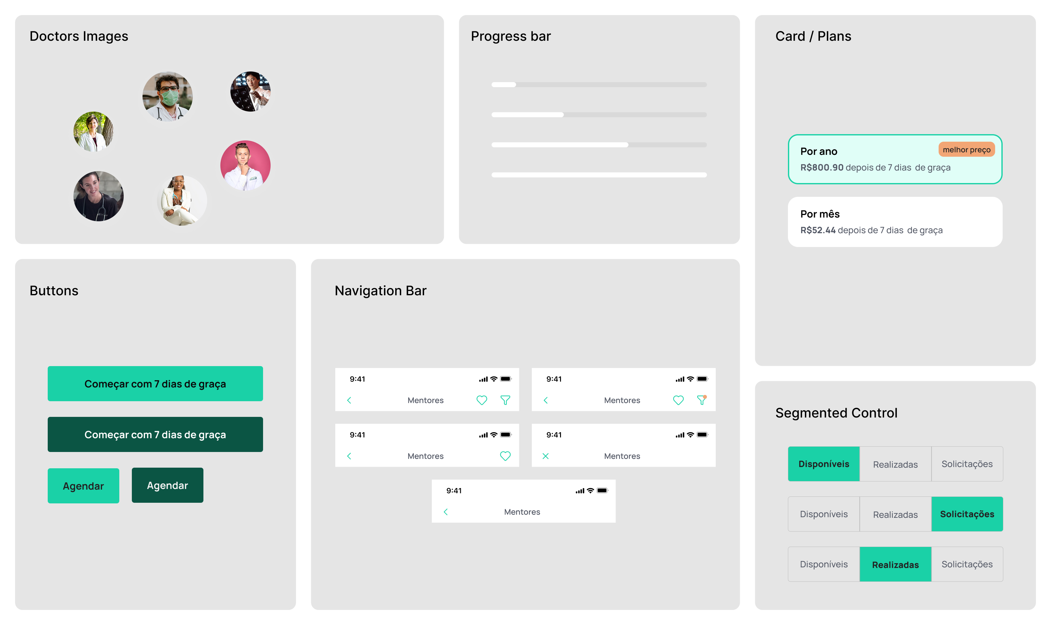
One of my focus points is the accessibility of the App's primary buttons, which I needed to improve by changing the color of the label to black. Many people with low vision and other diseases can get a better experience from this.
Check below the final solution with some UI components.
Next Steps & Validation Plan
Before deciding whether it is worth investing time in any kind of development work. I decided to run fake door testing, which is a lean technique to quickly test the viability and assess the market demand for a product before investing in its development.
To avoid disappointing the Sanar users and be transparent and honest with them. The test can be run only for a limited segment size of users to minimize the fallout.
So to measure if users have interest to use the feature 'Mentores' , we can analyze clickthrough rate (CTR) on the button with the label “Começar com 3 dias de graça", then if a validation is got the development will be started.
Learnings
This project gave me a better insight into the education market and how is the life of people who study to pass for residency in Brazil, after talking with 5 people in this scenery. The research has shown me how the subject needs to be explored more and how many possibilities can came up in this enormous market. I had only 1 week to work on this project, and I believe I could have had a better delivery if I had dedicated more time to it.