Reduced creator onboarding drop-off from 32% to 18% while maintaining marketplace
data quality
Design challenge
Reduce user drop-off during onboarding.
Role
Product Designer working across UX, UI, mobile flows, product thinking, and design handoff.
Timeline
1 year and 7 months
Company
Insense
Why this mattered
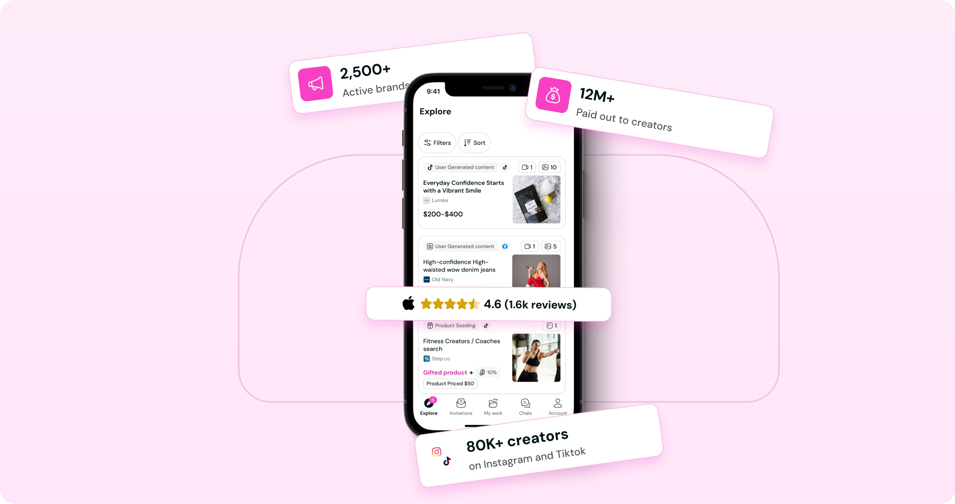
Insense is a two-sided marketplace where brands hire creators and creators apply for campaigns. High onboarding drop-off meant fewer complete creator profiles entered the marketplace, potentially reducing the pool of relevant talent available to brands.
How I start to handle this design challenge?
I reviewed the onboarding flow step by step to understand where creators could feel confused, uncertain, or overloaded.
I also analyzed direct and indirect competitors to identify familiar patterns, messages, and interactions already used by creators.
To better understand the creator experience, I created a TikTok account and changed my Instagram account to a professional account. This helped me understand the language, setup, and expectations creators have on social platforms.
This analysis helped me identify three main sources of friction: unclear value, high effort in some steps, and trust concerns around important decisions.
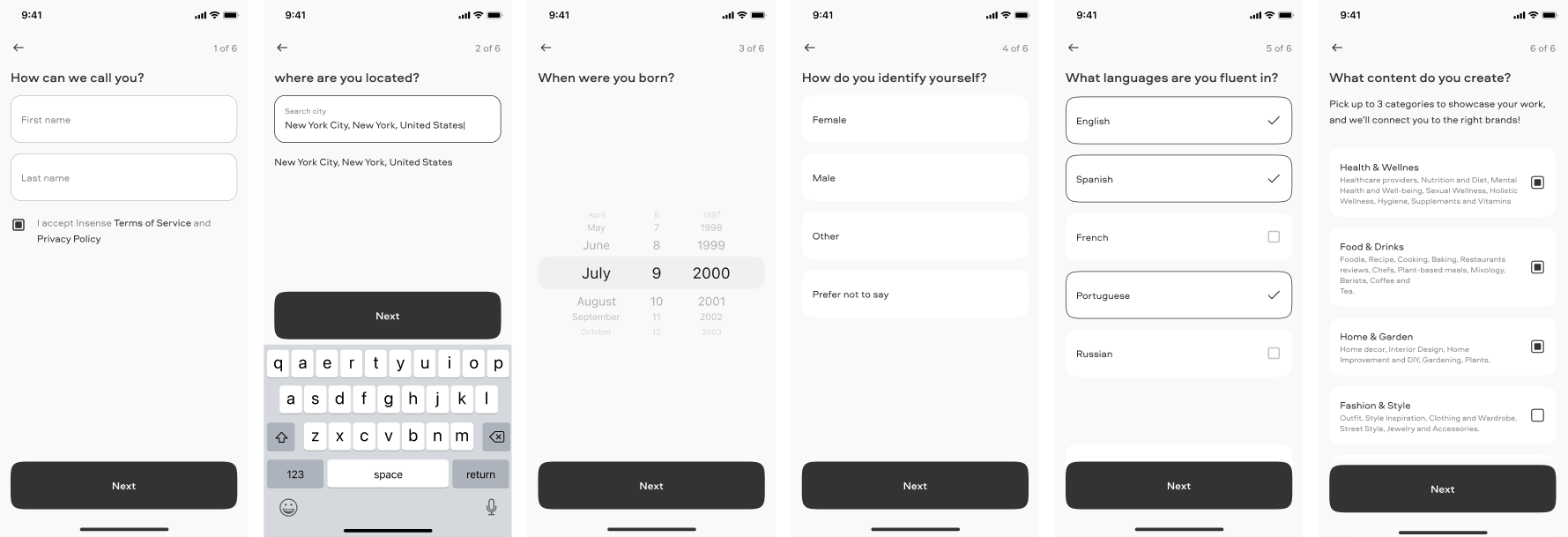
A critical onboarding decision: connecting a social account
Only 47.5% of creators connected Instagram or TikTok. The experience did not clearly explain the value, data access, or the option to connect later. The challenge was to increase connections without reducing trust or user control.
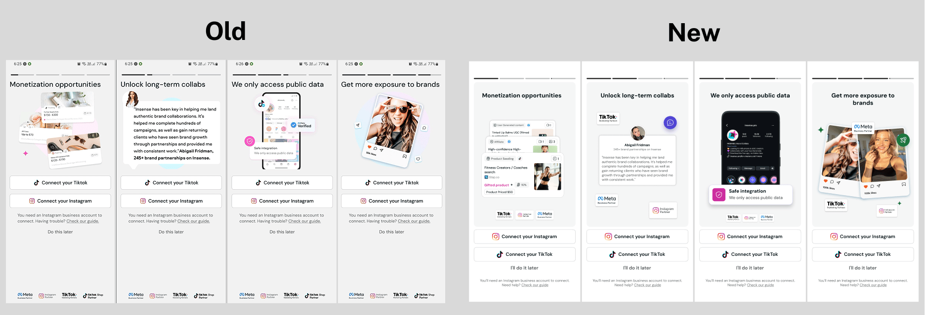
How might we use familiar patterns to make onboarding easier?
The Growth team had already mapped competitors’ onboarding flows in Miro. I used this analysis to understand the patterns creators were familiar with, compare how other products explained each step, and improve the onboarding without reinventing the wheel.
Design decisions behind the final solution
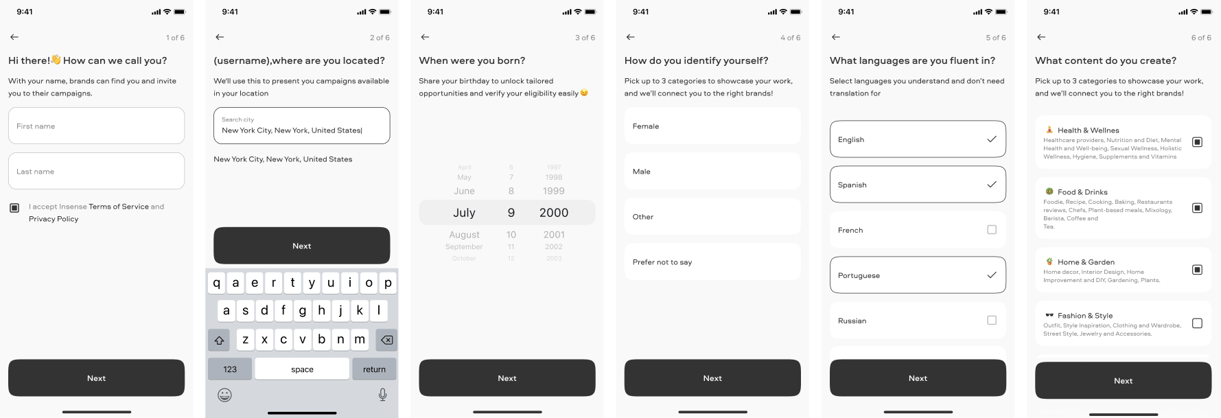
The final solution focused on reducing perceived effort during onboarding. Each step explained why the information was needed and how it could benefit the creator.
Clearer copy made the journey feel more guided and transparent. Visual cues, such as emojis and category examples, helped creators scan options faster without replacing clear labels.
In retrospect
One of the strongest learnings was that personalization requires transparency. Users need to understand why specific information is being requested and how sharing it can improve their experience. The project also reinforced that onboarding is not only a sequence of steps, but a communication layer: clear and motivating copy can help users understand the value of continuing. Finally, collaboration across Engineering, Product, and Growth brought different perspectives into the process, challenged assumptions, and enabled more informed design trade-offs.